Elements of Design – Part Two – Balance
Deb Silva – Samples by Deb Silva
We humans seek balance, in our lives and in our art. Can you recall working on a spread that just didn’t feel right, maybe it made you feel a bit uncomfortable; it was probably out of balance. Our sense of equilibrium holds in a balanced composition
When we talk about balance, what we’re actually talking about is visual weight, or more accurately the distribution of visual weight in a design. Here we go back, in part, to color theory. Visual weight refers to the relative value, (that is, lightness or darkness of a color), size, or hierarchy of objects in a composition.
Think of a line centrally balanced on the point of a triangle – you can maintain that balance with equal weight on either side, by moving a heavier object closer to the center, or by adding two smaller objects to one end.
Types of Balance:
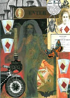
Formal, or Symmetrical Balance is calm; it repeats similar lines, shapes, or colors, almost as if laid out on a grid. Its symmetry holds an equal distribution of visual weight. It can also sometimes be a mirror image, as in architecture.
1
Asymmetrical balance seeks to create tension. It’s a bit trickier, but there are several ways to go about it. These consist mainly of, value and color, texture and shape, and eye direction and position.
First, value and color – small areas of bright color can be used to balance larger areas of neutral color, just as large areas of lighter color will balance smaller areas darker in value. You can also use color temperature here, red and yellow, or high contrast color, to the visually lighter side, will add weight to that side.
Texture and shape – A large empty space, or flat area will be nicely balanced by a smaller highly textured or irregularly shaped object that draws the eye.
Eye direction and positioning – You can lead the viewers eye with the use of triangles, or directional placement of figures, thus creating a focal point which gives your composition balance even if most of your visual weight is on one side.

2
3
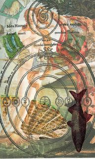
Radial balance is quite simply, means having all the components in your composition radiating out from a single focal point.
4
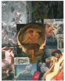
Crystallographic balance – Here we have no focal point and the balance comes from equal emphasis over the whole composition. A piece like this is sometimes laid out on a gird.

5
One more thing I thought worth mentioning here is the Rule of Thirds, used by Graphic Designers. – This is done by dividing the composition into thirds vertically and horizontally, then placing important elements at intersections, or within the thirds to achieve balance.
I hope you’ve found this topic as interesting as I do. I can spend long moments in the art museum looking at Kurt Schwitters’ collages trying to figure out why they work so well. I know it’s not color; he used such neutral papers, so it has to be balance that created such amazingly wonderful pieces of art!
(Group Quilt by Deb Silva, Judy Perez, Yoshiko Kawasaki, Frances Alford, Julie Upshaw, Sherri McCauley)
Deb Silva – Samples by Deb Silva
We humans seek balance, in our lives and in our art. Can you recall working on a spread that just didn’t feel right, maybe it made you feel a bit uncomfortable; it was probably out of balance. Our sense of equilibrium holds in a balanced composition
When we talk about balance, what we’re actually talking about is visual weight, or more accurately the distribution of visual weight in a design. Here we go back, in part, to color theory. Visual weight refers to the relative value, (that is, lightness or darkness of a color), size, or hierarchy of objects in a composition.
Think of a line centrally balanced on the point of a triangle – you can maintain that balance with equal weight on either side, by moving a heavier object closer to the center, or by adding two smaller objects to one end.
Types of Balance:
Formal, or Symmetrical Balance is calm; it repeats similar lines, shapes, or colors, almost as if laid out on a grid. Its symmetry holds an equal distribution of visual weight. It can also sometimes be a mirror image, as in architecture.

1

Asymmetrical balance seeks to create tension. It’s a bit trickier, but there are several ways to go about it. These consist mainly of, value and color, texture and shape, and eye direction and position.
First, value and color – small areas of bright color can be used to balance larger areas of neutral color, just as large areas of lighter color will balance smaller areas darker in value. You can also use color temperature here, red and yellow, or high contrast color, to the visually lighter side, will add weight to that side.
Texture and shape – A large empty space, or flat area will be nicely balanced by a smaller highly textured or irregularly shaped object that draws the eye.
Eye direction and positioning – You can lead the viewers eye with the use of triangles, or directional placement of figures, thus creating a focal point which gives your composition balance even if most of your visual weight is on one side.

2


3

Radial balance is quite simply, means having all the components in your composition radiating out from a single focal point.

4

Crystallographic balance – Here we have no focal point and the balance comes from equal emphasis over the whole composition. A piece like this is sometimes laid out on a gird.

5

One more thing I thought worth mentioning here is the Rule of Thirds, used by Graphic Designers. – This is done by dividing the composition into thirds vertically and horizontally, then placing important elements at intersections, or within the thirds to achieve balance.
I hope you’ve found this topic as interesting as I do. I can spend long moments in the art museum looking at Kurt Schwitters’ collages trying to figure out why they work so well. I know it’s not color; he used such neutral papers, so it has to be balance that created such amazingly wonderful pieces of art!
(Group Quilt by Deb Silva, Judy Perez, Yoshiko Kawasaki, Frances Alford, Julie Upshaw, Sherri McCauley)


Comments