Essentials of Design - Part One – Color Theory
Deb Silva
What’s your favorite color combination? Think about some stunning pairs, teal and fuchsia, red violet and yellow green, violet and gold. Or how about some natural occurrences, the red of bright strawberries and their green leaves, purple crocus with yellow stamens, and blue iris with vivid orange pistils. Turns out, all of these combinations are easily identified as wonderful choices on the color wheel.
Want a great finished piece? Consult your color wheel.
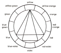
The wheel is made up first of the primary colors; we remember these from grade school, they are red, blue and yellow. From these three colors come the secondary colors, violet, green and orange, and then the tertiary colors, red-orange, yellow-orange, yellow-green, blue-green, blue-violet and red-violet.

color wheel
Okay, so we have a color wheel, now what is it good for? Color schemes! The simplest combinations are complementary colors which lie directly across from each other on the wheel. Complementary color schemes are red and green, yellow and violet, and orange and blue, think back to our floral examples. Before we delve more deeply into the wheel, let’s talk about some of the qualities of color.
A pure color is called a hue, and within each hue lie many variations, add white to a hue and you have a tint, red goes to pink, for example. Add gray to a hue and you have a tone, red goes to burgundy, add black, a shade. To make things even more interesting, colors have value that is a color’s relative lightness or darkness. A really stunning spread will have elements of differing value as well as different colors. Some tricks designers use in their work involve value, darker colors recede, while lighter colors seem to come forward.
Colors also have what we refer to as temperature. Cool colors, the blues and greens recede, while the warm colors, yellow, red, and orange come forward and tend to dominate. Yellow is a very strong color and is often the smallest amount of a color in a scheme so as not to overwhelm. Purple is interesting in that it goes both ways depending on whether it’s leaning to the red side, or the blue side of the color spectrum.
So now, back to the wheel, if you are looking for a calm outcome, you will want to use what are called analogous colors. These are colors lying next to each other on the color wheel. Blues and greens for example.
Another interesting choice for a spread is monochromatic, tints, tones and shades of the same color. A good rule of thumb is any colors adjacent on the wheel work well together. Adding in a third color is easy with the wide triangle, we know the primary colors work well together, so then do any other combinations under the spin of the triangle. And really smashing are the split complements. Split complementary schemes are formed by zeroing in on a color, and then choosing colors from either side of it, and its complement. Tangerine, (yellow-orange), and aqua, (blue-green), or orange, violet, and blue violet are all split complementary color schemes. And remember, once you know the rules, they are made to be broken, it if works don’t fix it!
My favorite color writer is Joen Wolfram who I was lucky enough to have judged one of my quilts in a show. Thanks, in part I’m sure, to following her advice, the quilt won.
Deb Silva
What’s your favorite color combination? Think about some stunning pairs, teal and fuchsia, red violet and yellow green, violet and gold. Or how about some natural occurrences, the red of bright strawberries and their green leaves, purple crocus with yellow stamens, and blue iris with vivid orange pistils. Turns out, all of these combinations are easily identified as wonderful choices on the color wheel.
Want a great finished piece? Consult your color wheel.
The wheel is made up first of the primary colors; we remember these from grade school, they are red, blue and yellow. From these three colors come the secondary colors, violet, green and orange, and then the tertiary colors, red-orange, yellow-orange, yellow-green, blue-green, blue-violet and red-violet.

color wheel

Okay, so we have a color wheel, now what is it good for? Color schemes! The simplest combinations are complementary colors which lie directly across from each other on the wheel. Complementary color schemes are red and green, yellow and violet, and orange and blue, think back to our floral examples. Before we delve more deeply into the wheel, let’s talk about some of the qualities of color.
A pure color is called a hue, and within each hue lie many variations, add white to a hue and you have a tint, red goes to pink, for example. Add gray to a hue and you have a tone, red goes to burgundy, add black, a shade. To make things even more interesting, colors have value that is a color’s relative lightness or darkness. A really stunning spread will have elements of differing value as well as different colors. Some tricks designers use in their work involve value, darker colors recede, while lighter colors seem to come forward.
Colors also have what we refer to as temperature. Cool colors, the blues and greens recede, while the warm colors, yellow, red, and orange come forward and tend to dominate. Yellow is a very strong color and is often the smallest amount of a color in a scheme so as not to overwhelm. Purple is interesting in that it goes both ways depending on whether it’s leaning to the red side, or the blue side of the color spectrum.
So now, back to the wheel, if you are looking for a calm outcome, you will want to use what are called analogous colors. These are colors lying next to each other on the color wheel. Blues and greens for example.
Another interesting choice for a spread is monochromatic, tints, tones and shades of the same color. A good rule of thumb is any colors adjacent on the wheel work well together. Adding in a third color is easy with the wide triangle, we know the primary colors work well together, so then do any other combinations under the spin of the triangle. And really smashing are the split complements. Split complementary schemes are formed by zeroing in on a color, and then choosing colors from either side of it, and its complement. Tangerine, (yellow-orange), and aqua, (blue-green), or orange, violet, and blue violet are all split complementary color schemes. And remember, once you know the rules, they are made to be broken, it if works don’t fix it!
My favorite color writer is Joen Wolfram who I was lucky enough to have judged one of my quilts in a show. Thanks, in part I’m sure, to following her advice, the quilt won.


Comments